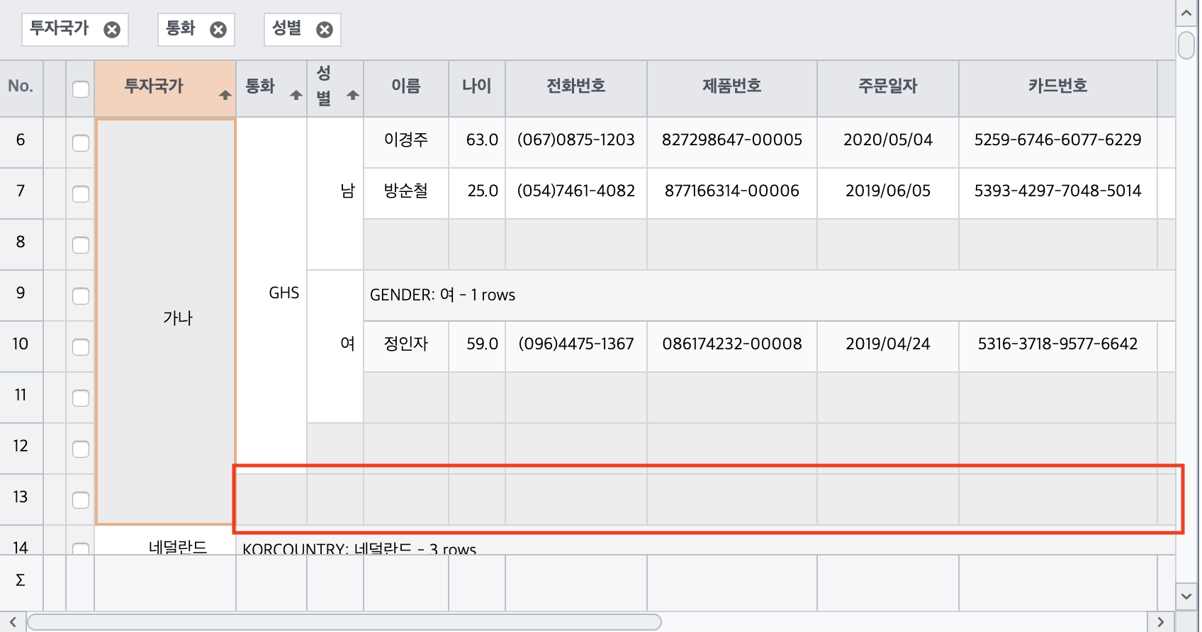
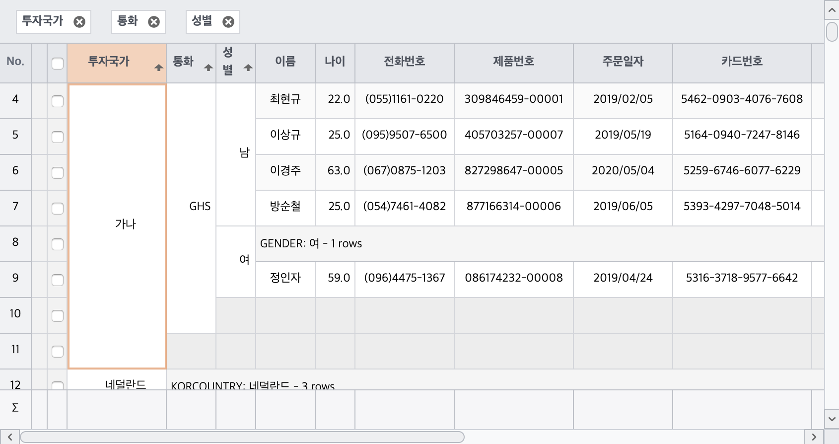
Row merge grouping
When grouping rows, grouped column cells are displayed as merge cells.
Row merge grouping
If the RowGroup.mergeMode property is set to true, grouped column cells are displayed as merge cells when grouping rows.
gridView.setRowGroup({ mergeMode: true });Like Row Grouping, you can display it by adding a Header or Footer to each group.
Likewise, the text to display in the group header can be specified with the rowGroup.headerStatement property, and the value to display in each footer cell can be specified with Column.groupFooter.expression.
RowGroup settings
The setRowGroup() function sets information related to the grid RowGroup.
When in the rowGrouping state, you can set the display method of the group footer and group header depending on the expanded or collapsed state of the group.
When children are being ‘marked’
gridView.setRowGroup({
   expandedAdornments: $(':radio[name="expanded"]:checked').val()
});
When children are in a ‘hidden state’
gridView.setRowGroup({
   collapsedAdornments: $(':radio[name="collapsed"]:checked').val()
});
Expander display
gridView.setRowGroup({
   mergeExpander: $(':radio[name="expander"]:checked').val()
});
Limitations
Restrictions in merge mode are as follows.
- Grouped columns are placed in order at the front of the grid.
- The position of grouped columns cannot be changed.
Show some group footers
When MergedRowGroup, you can use the createFooterCallback property to set the footer to be displayed only for some groups.
gridView.setRowGroup({
     mergeMode: true;
     createFooterCallback: function(grid, group) {
       if (group.level >= 3) {
         return false;
       }
       return true;
     }
   });
Show entire group footer
Apply group footer hiding for level 3 and above
Group footer multi-line output
You can display the group footer in multiple rows or dynamically display only the group footer at a specific level to be displayed in multiple rows.
This is a demo that does not output group footers of level 2 or higher if the footerIndex is 1 or higher.